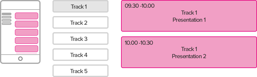
Two types of agenda
So my first thoughts were that there are two very different agendas that are needed, a single track agenda where there is only one row of presentations and a multi track agenda where there is multiple rows. The single track is definitely a lot simpler than a multi-track agenda. The multi-track agenda has so many more parts just by nature and these all must fit together perfectly
the two types of agenda.
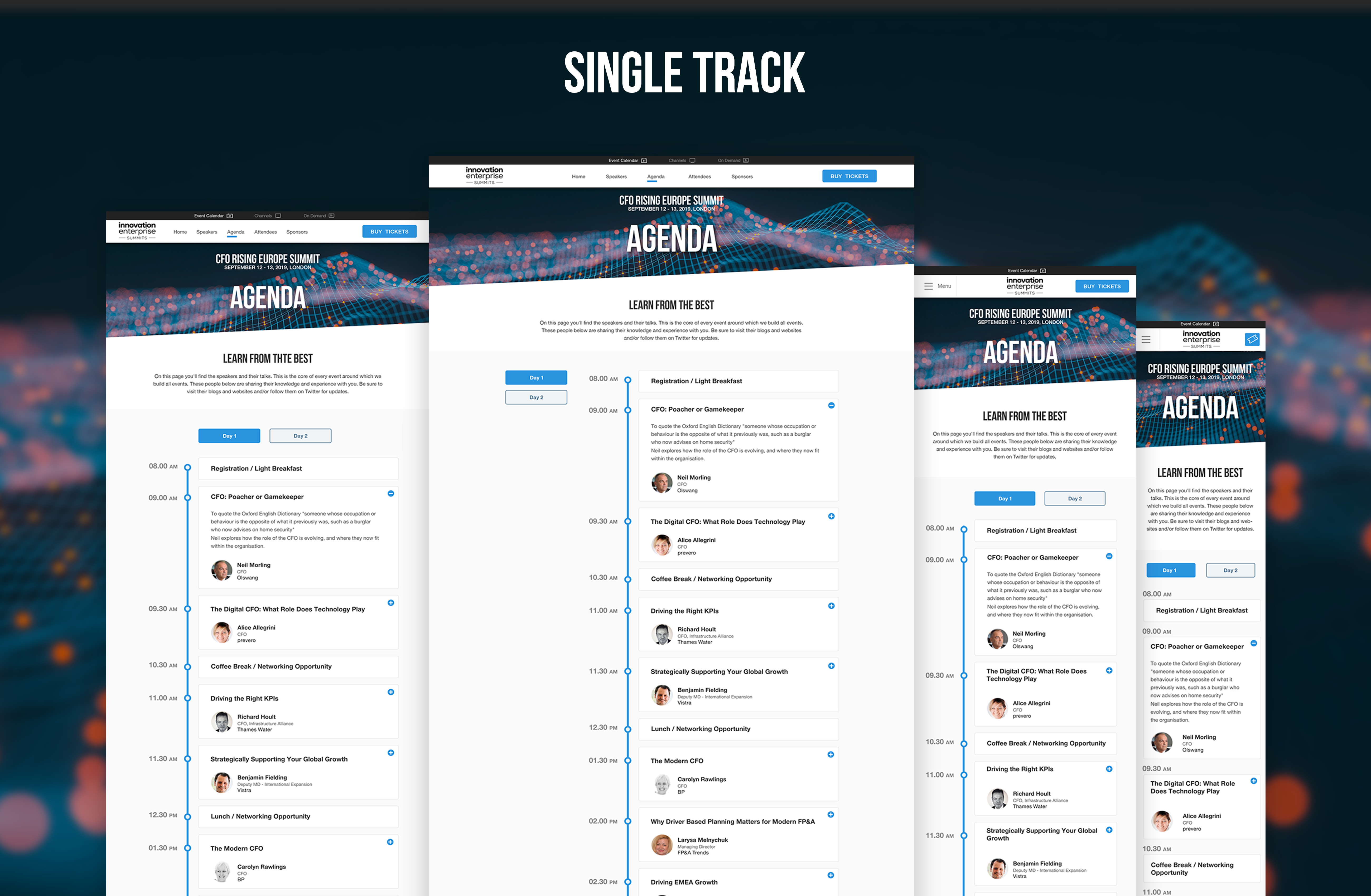
Single Track
The Single track agenda is linear, There is only one route from start to finish.
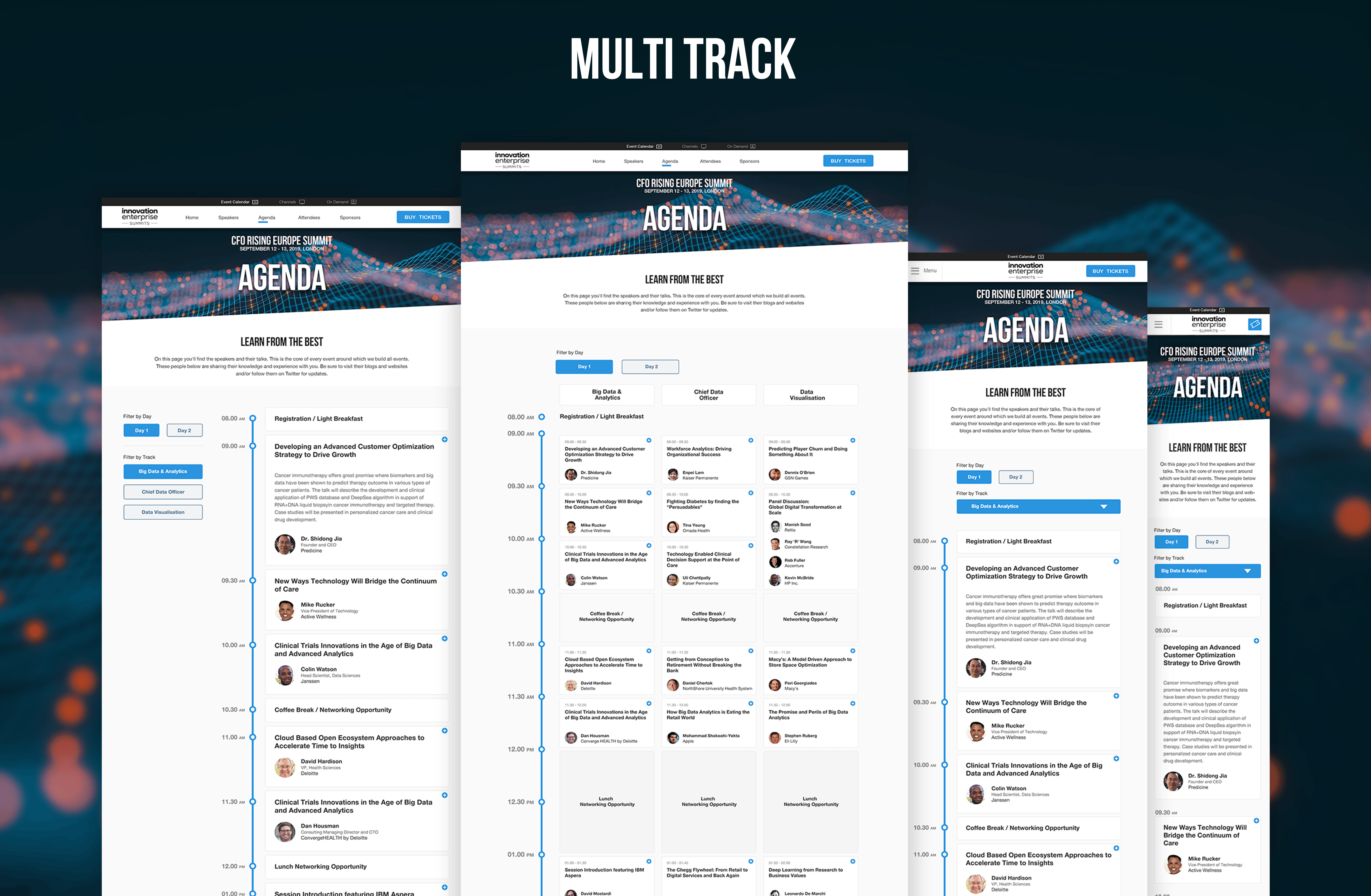
Multi Track

The Multi track is where multiple tracks run alongside each other and a delegate can move between tracks.
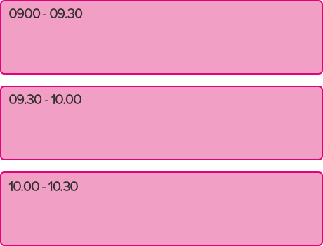
Time accurate cards
One of the issues that I came across first was that these presentations didn’t always start or finish at the same time so this would have to be clear to the user.
Not Time Accurate
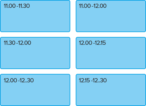
Problem
This could easily lead a user who was browsing through the agenda to believe that all these presentations were the same length of time.
Time Accurate
Solution
This was a lot was easier for users to see the difference between the lengths of presentations.
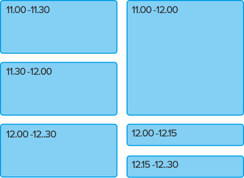
Mind the Gaps
The vertical space between the presentations has to be taken into account, It has to be included as part of the presentation card height otherwise it mucks up the time accuracy if there are different amount of presentations on each track.
Gaps independent from cards
Problem
It looks like the 2nd Track finishes 5 mins earlier the more this happens the bigger the gap gets.
Gaps incorporated into cards
Solution
By including the gap within the presentation card everything starts and finishes where it should.
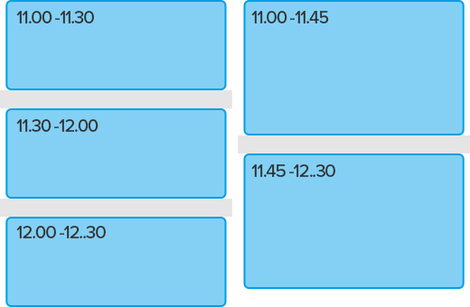
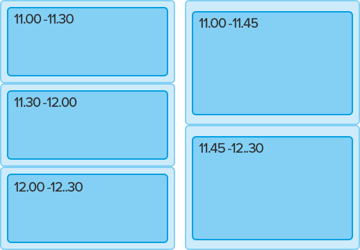
The Trouble With Being Time accurate
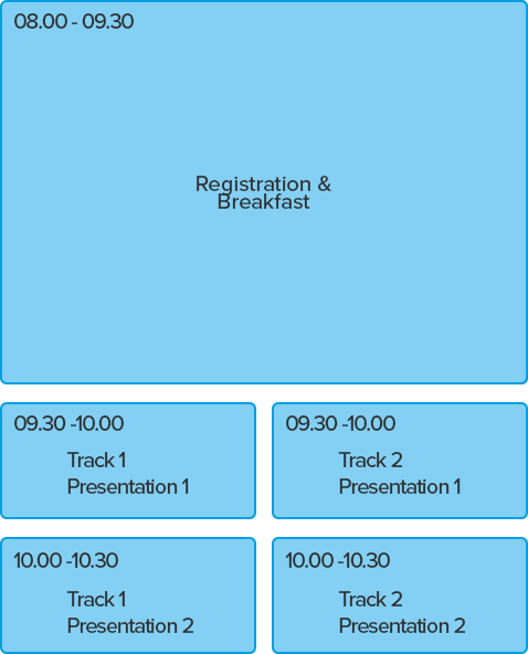
Every event has a registration period of around one and a half hours where delegates can come in and register then have breakfast. At the end of day one there is networking drinks that lasts potentially two hours. The issue with these is that on a time accurate agenda takes up a lot of space, and looks like a delegate is paying for a day where the majority is registration or network drinks.
Big Breakfast
Problem
Showing a time accurate breakfast/registration really shows how big it is compared to a presentation, and could potentially put delegates off.
Hiding how big breakfast was
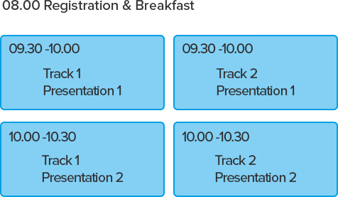
Solution
Heads & Tails style slot
This alternate time slot is used to hide the amount of room an accurate timed registration or networking drinks will take up. It will only work at the start or end of a day. It is the only part of a multi track agenda that isn't time accurate.
Sometimes there just isn’t enough room
When there is enough room we show multiple tracks next to each other, as its alot easier to understand and plan a day, However when there isn’t enough room to show tracks next to each other we revert back to the single track view with a tab down the left hand side to select which track the user wants.
Responsive Layout changes
Responsive changes Multi to a single track (With track filter) type agenda view when there isn’t enough space.
Desktop
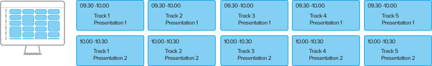
This displays all the presentations in a way that is easy to plan, which is great when you have a screen big enough to do this.
Tablet
Now there isn’t enough room to display the presentations side by side. The agenda now turns into the single track view. The single track view display is more like the single track event but with a tab system to change which track is displaying.
Mobile

The tab now becomes a dropdown for selecting which track is displaying.
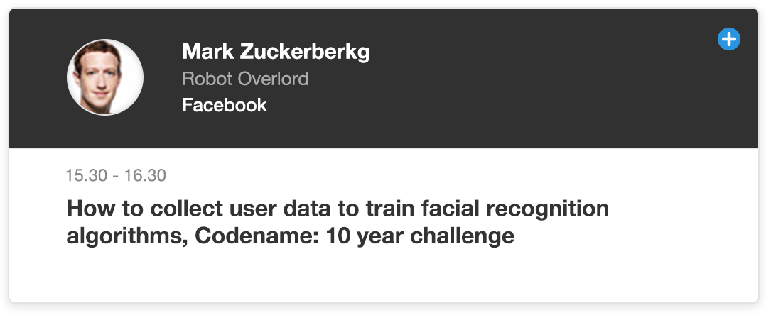
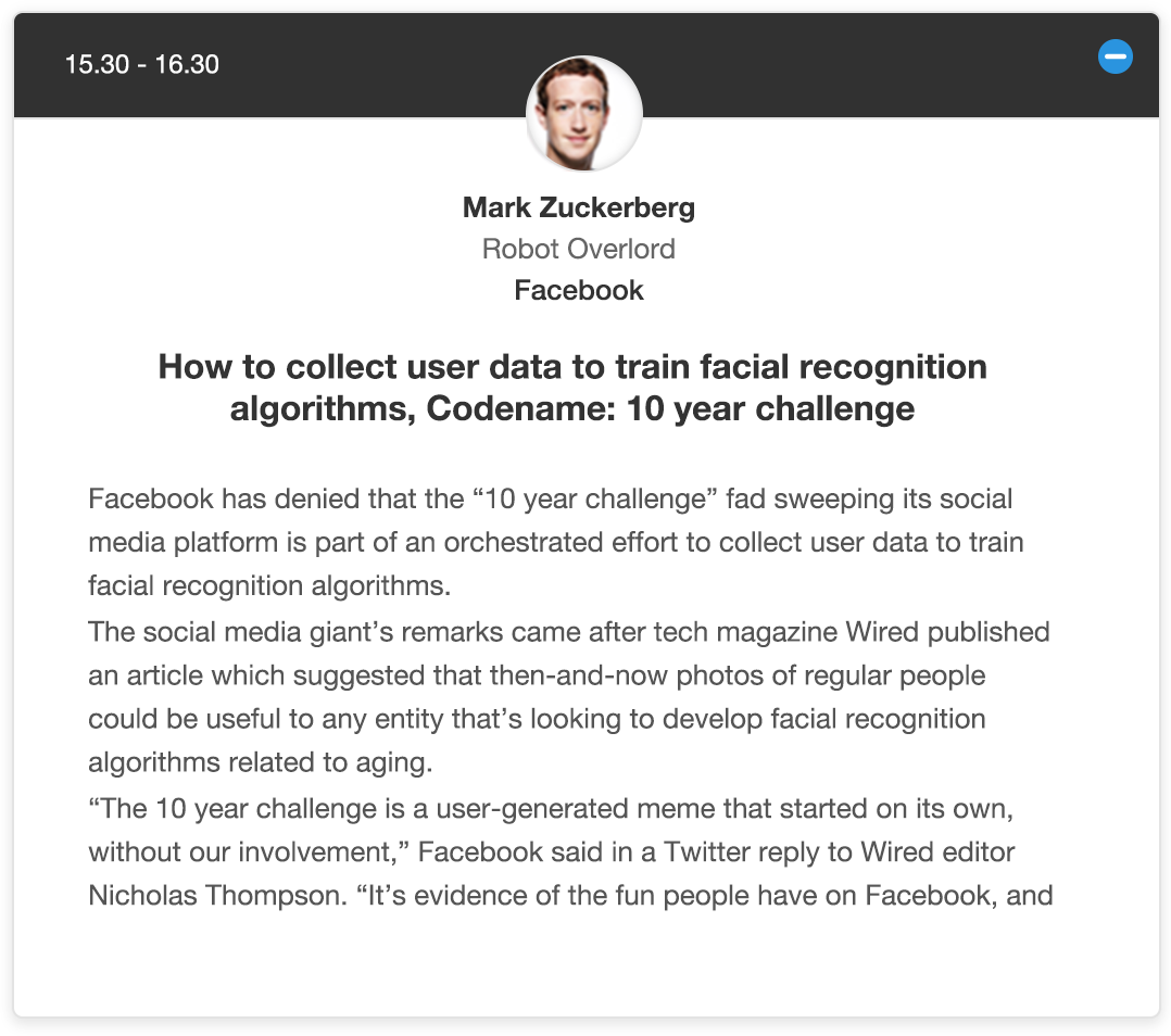
The Two Card Types
It was important to work out the different presentation card types, and how they would work across the two different agenda types.
Single track Agenda

The presentation card opens up and pushes everything below it down.
Multi track Agenda

As the presentation card can't slide down like on a single track, as that would throw everything off time that was below it, We used a modal to overcome this issue.
Card Concepts Hi Fidelity
First attempt at putting some ideas together for the presentation cards.
Concept: Top Bar
Reg Presentation closed
Reg Presentation Open

The top bar works well on regular presentations with one speaker and leaves enough room for long names and job titles.
Panel Session closed

Panel Session Open

Fairly happy with this but with so little space on the multi track agenda this will not work.
Concept: Top Stripe
Reg Presentation closed

Reg Presentation Open
The speaker profile picture and the presentation time get closer together as the screen width reduces.
Panel Session closed

Panel Session Open

Panel Session open suffers with speaker headshot being repeated as there isnt enough room to have the names near the top stripe, and didn't want the headshots to disappear and leave an empty top stripe.
Concept: Side Bar
Reg Presentation closed

Reg Presentation Open

Fairly happy with this on a regular presentation the open card could potentially display speakers social media links in the expanded sidebar.
Concept:Barebones
Reg Presentation closed

Reg Presentation Open

This was by far the most vanilla option however with all of the space constraints of the multi track agenda cards this could be the only option available.
Panel Session closed

Panel Session Open

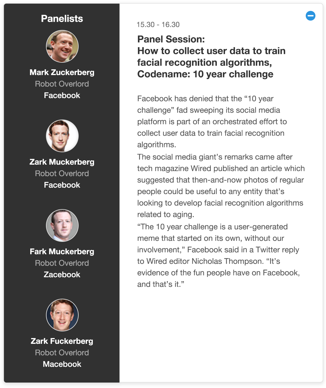
The card slides open the same as a regular presentation to reveal the panelists names.
Time equals height
So I knew that space in the time relative cards would be limited but wanted to get a better idea of this, I tested out a few different scales and padding options but this worked the best. Too small and there was no room in the standard thirty minute presentation, Too much and the one hour presentation looks massive and empty.
Time Scale 1min:6px
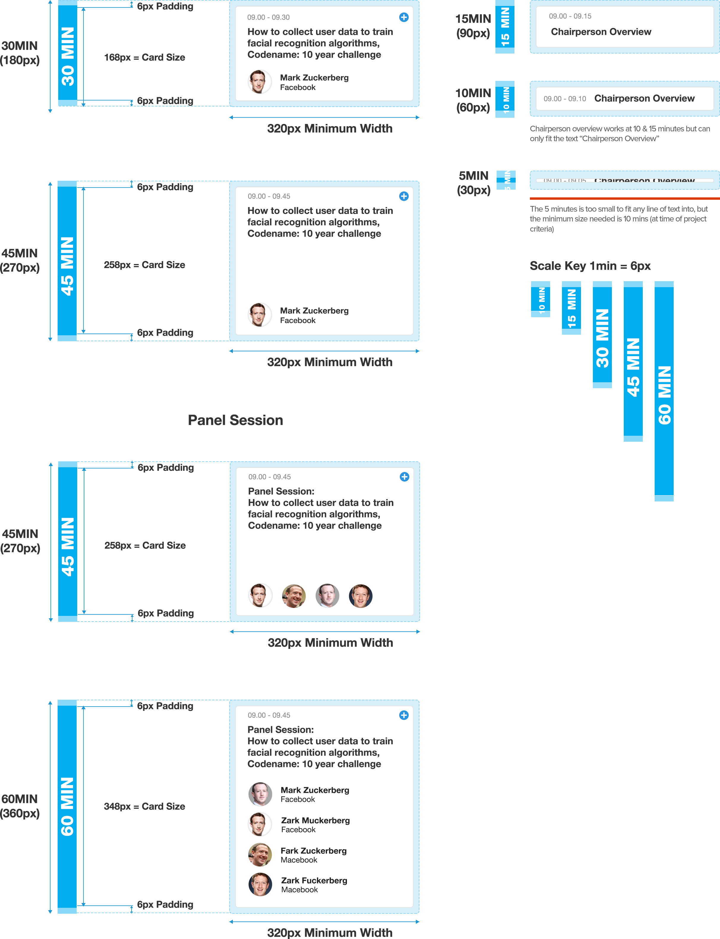
The job title was removed to free up some space, (it re-appears once the card is opened) But there really isn't too much room for decoration, and I think it needs to be consistent from single track view to multi track view. So the plain option is looking like a winner at the moment.